Good designs are tough to come by. The struggle to design sets holistically, so that they play well in limited, but also include enough original cards that do new things or are pushed too far up the power curve to be balanced in limited. Today I am going to share some of my favorite cards from the last few sets and talk about what makes their designs so interesting.

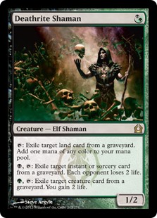
Deathrite Shaman is an excellent card to begin with. It is powerful, but not universally so. It is great in the right deck or against certain strategies, but it isn't a universally dominant card like say, Tarmogoyf. It is helpful in most any game situation. Its abilities have internal symmetry. It has a reasonable casting cost, letting it go into a wider variety of decks. It has reasonable power and toughness for competitive constructed playability in many formats. The flavor aspects of the card bring the package together nicely: the shaman performs different rituals on the dead. It has appropriate subtypes that are relevant for casual and competitive deck construction. The art actually shows the creature itself,
doing what it does. Brilliant.
This design is original. No other card is really that much like it and it does something different than the other cards in Return to Ravnica, but it still
fits into the theme of the Golgari guild perfectly. The card is balanced in limited and is properly slotted as a rare. This helps alleviate the complexity it can add to game play. This card scores high marks in pretty much every category. The only downside? It is a little wordy. It has three abilities where I think just one or two abilities with better wording might serve better. Overall great concept, great execution, great results.

Core sets used to be notorious for lacking in quality design. The decision to print new cards in core sets was an excellent move. Now they can be a breath of fresh air. A place where single card designs have a place to shine, without having to worry about the restrictive themes of block set design, like
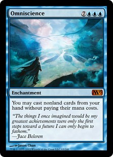
Yeva. Omniscience is one such card. It has no silly block flavor. It has standalone flavor, like every great standalone design should. Magic is about planeswalking; movement through different dimensions basically. When you step outside of a dimension you get to see how to circumvent the obstacles that are confined to that dimension. The art shows, Jace, the Mt:G frontman, walking the paths between planes, overcoming all of the worldly obstacles that use to restrict him. It is a whole block worth of story on one card, AND YOU DON'T EVEN NEED THE FLAVOR TEXT. There are a few flavor problems though when it comes to how this card plays. Why is it an enchantment? The effect feels like something you would get off and emblem. Why does Naturalize destroy your Omniscience? Does rusting swords or vines growing on statues really break up your access to INFINITE KNOWLEDGE?
Some other small problems include: why does a bunch of Blue mana give you basically infinite mana of any color? No idea. Why is this card Blue? I can see it being 5 colors. I can see it being no colors. I can see it being Black and costing a bunch of life...sure.
On the positive side this card is exciting. It is fun as all get out to play with. It screams to be built around. It has a reasonable cost for the effect it gives you, which is kind of weird to say for something with CMC 10. It doesn't make you win automatically, because that is no fun, but it makes it
feel like you can't lose. This card isn't exactly limited playable, but it doesn't try to be (and besides, core set limited is awful).
This card isn't exactly unique, the effect hasn't been done before, but there are tons of invest-e-chantments that change the rules of the game:
Future Sight.
Dream Halls. These cards are usually pretty cool and end up being the basis for future cards that are modeled after them. Artifacts and enchantments are kind of the testing ground for what is acceptable on a Magic card. I often characterize these cards as being lame and unplayable, but they are usually examples of good design decisions and almost always let you do something new. Which is what I like to see from a new card.
What I really like about this card: Nice, simple, clean text box. It does what it does. One sentence: something that use to be true about the game is now irrelevant. That BUILDS resonance THROUGH awesome conveyance. That is powerful design.

So let's say you made a cool keyword mechanic, like Flashback. People like it. It plays well. How do you push it into the stratosphere? Well, people want to be able to Flashback their other spells, ya know, the ones that don't have Flashback. You could make a lame invest-e-chantment, a la
Cast through time. That happens all the time. Snapcaster is sweet because it is different. It is all value. It is exactly what you want from your card: pressure, time, tempo, more cards. I don't know exactly what the flavor of this card is supposed to be, but it passes every other test. Maybe he's got an arm cannon full of dream juice that makes you relive your past, where that one spell happened, that one time...ya know. At any rate, this card is a home run design wise. It is fun for every type of player and they managed to make a card that is a role player in literally every format without being a flat-out broken all-star.
This card has a bunch of text too, because it has to be there for the rules, but you don't need to read it all to know what it does. It does what you think it does. Conveyance.

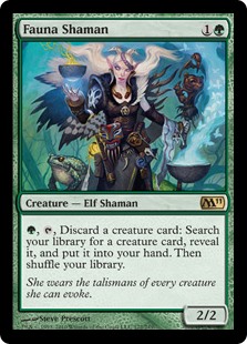
Fauna Shaman. It's a throwback card. I like these. This is much cooler than a straight reprint in my mind. You can take an inherently imbalanced card and make it balanced for the modern game. The ability is basically the same, but you can't go off doing it multiple times. It has the same cost, but you can't use it right away. You make it easier to remove, to make it less broken. And after all that you give it power so it can attack in the moments where the ability isn't useful. Awesome work. It resonates with old players who remember
Survival. It works with new cards that have been in recent sets:
Bloodghast,
Vengevine. I love it. It's cool for everyone. I like when design takes smaller, controlled risks like this. Incremental improvements on a historically destructive card.
I think the flavor of this card could be a bit more evocative of it's distant mechanical cousin. Maybe it could have a name that makes the linkage more obvious? That is kind of what flavor is for right?

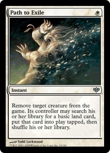
Speaking of these so-called 'spiritual reprints', some of them come in slightly different form. Path shows that you can take a basic effect from a popular old card and just tweak it minorly. They change the drawback. It isn't a strict upgrade or downgrade. It really isn't any more modern than its predecessor. It is just different. I like these small tweaks. They add new wrinkles of playability to standard effects like removal or bounce.
Some other cool tweaks: adding a cantrip, adding symmetry or breaking symmetry it, adding a related or synergistic effect, or moving the card into a new (hopefully appropriate) space on the color pie, or even adjusting the cost.
The major hiccup that Path presents is that the flavor doesn't make a lot of sense...with the name. Swords to Plowshares: a soldier defects and goes on to be a farmer. Farmer's develop and cultivate land. Something like that, right? So maybe Path should be called swords, but then, what should swords be called? Who knows. Flavor doesn't always work, I guess.
These last two show good examples of how you can innovate, even when the card concept isn't exactly original.
So that's what I think makes a good design and some cards that I think were well-designed. I hope this gave some insight into how I am as a fan and customer of the game and how this game we love is enhanced by employing good design skills.

No comments:
Post a Comment