Hey Zoners, Grandpa here. Today I want to finish up my discussions of Commander 2013 by talking about a few of the sweet reprints. There were certainly a lot in the set, so I am going to limit it to just the cards that I think received a wholesale upgrade. Many cards were printed with new arts, some for the first time like Lim-Dul's Vault. Some however got art or flavor text that was less than appealing. Here are the cards that I think actually got improved through this exchange, based solely on my own opinions.
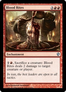
Right off the bat we have a spicy one. Check out this art. Look at it. Feel the creepiness. The disgusting, visceral liquid dynamics showed off in this piece. It's like we went to the menu in a game of Magic and turned the Gore levels up to
EXTREME. It really showcases the power of fully digital art. The original printing had art that was specific to the ogres in the Sokenzan mountains of Kamigawa, this new pic is much more general fantasy/horror and more appropriate for a set that has no specific flavor of its own. I like how the flavor text ties together the brutality and callousness behind sacrificing your own soldiers just to harm your enemies. It feels like war. It feels like Red. This is an awesome update.
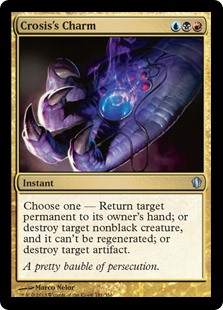
I have always been a big fan of this cycle and the Charm trope in Magic in general. I love options from a mechanical standpoint, but for design they give you tons of flexibility when exploring how the color pie can fit together onto multicolor cards. Each ability is iconic and evocative of its contributing color. The total package ties together nicely into archetypal answer card from one of control's best color combinations. The addition of sweet flavor text is just icing on the cake. It calls back to it's namesake card: Crosis, the Purger, whose combat damage trigger allowed you to 'Persecute' your opponent. This is a card that I actually play and I am excited to see it get re-imaged for a new generation.
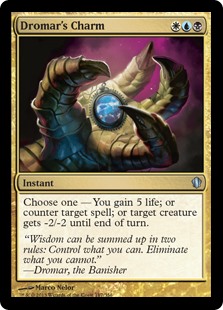
I like cycles just as much as the next guy, but it does sometimes bother me when Wizards or others feel obligated to include all five in a given environment/deck. For this reason I am very excited that the design team on this product chose to only include the good cards from this cycle. Not all the modes of this card are created equal, but the ability to just straight up counter any spell is already extremely flexible and, obviously, worth having on a card all by itself. The original art for this card was always a little strange to me. In it, Dromar's open claw was holding a token with a Greek-style capital statue. There is no ancient Greece in Dominaria so it felt a little off. That art was good, but this is better. I am not the biggest fan of this new flavor text, but at least it is a quote
from the character we are referencing with this card.
Such a sweet card. And such sweet stories have been crafted with it. This card one a world championship in the hands of Julien Nuitjen. Back in that day, E-Drag was hanging out with Wrath of God and Windswept Heath so...not much has changed. This card basically does it all for typical control decks. It ensures that you hit your land drops, provides card advantage in longer games, and gives you a recursive threat with which to win the game. I love the new art. A dragon biting it's own tail; a fascinating depiction of an ouroboros, a classic symbol of rebirth and the cyclical nature of life.
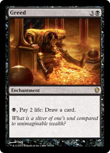
I have always been a fan of this card. Paying for cards with life appeals directly to my sensibilities as a player. I really do like this art, coughing up gold, choking on the riches that you sacrificed so much to get? I love it. It is awesome. It does bother me that basically every piece of art that this card has ever had features: 1. A pile of gold. 2. Somebody looking foolish. It can't be that tough for the creative team to come up with a new model for how to illustrate this concept, even if you don't want to change the 'flavor'. Prosperity isn't a sin. It is virtuous. Greed is a sin because it is costly. Show that in the art. Don't show the riches you obtain, show the sacrifice. The Blood Rites art did a great job of this, I think Greed would have been another fantastic opportunity to get gritty.
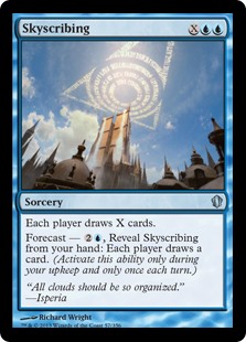
This new art is just gorgeous. This is a testament to how far the creative team has come in the last ten years. I complain about them a lot. I know I am a tough critic. But this is progress. Compare how this card looks to the original printing. The art is more complex, has better lighting, better focus. The flavor of the Azorius guild writing messages about law in the sky of Ravnica is executed so much more elegantly with the new RtR look. Now I am not a hundred percent sure how the law-mages scribbling edicts into the clouds relates to making people draw cards, but I will let them off the hook for this one.
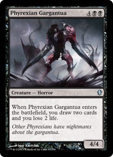
That art. DAT ART. It's scary, it's awesome. It has both 'ew' and awe. The landscape in the background, Mirrodin's black sun, the spires of the Mephidross spewing ichor into the air. It calls back to both Smokestacks and Phyrexian tower. The imagery unites the old and new Phyrexia beautifully. As for the subject, the whole living machine idea is at its creepiest when you literally have a organic body grafted into a cybernetic shell. It looks like the living weapons we saw in Scars block, which is super sweet. I agree with leaving the flavor text intact. No need to change what works.
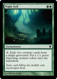
Finally, the return of a legend. This card has done so much work. Commander, Pauper, Cube, casual Tribal decks. And it is only a common! This card is a fan favorite and it deserves to have way more printings than it does. Awesome new art and flavor text that makes Thallids sound cool? That is a tall order, but the whole thing got delivered. I am very pleased to see this make a comeback and this card has truly found its home in the land of fat stacks.
....And that's about all I have to say about that. Some lighter fare than usual this week. I'll see you again next Sunday with another In General.

No comments:
Post a Comment