Heya Zoners!
There's a new non-Standard set ready to release this Friday. While it may be more for the Cubers, there's a few new Legendary Creatures on the landscape, which means Wizards didn't totally forget us, which means we have tech to talk about.
THE OLD
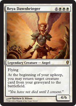
We'll begin by recapping unheard opinions on nonsense that already exists.
I have to say, I'm glad they went with the invasion artwork. This card is kind of a running joke in my metagame, because most of the players who play this have the promo with the world's most horrible foiling.
Perhaps there's now a good way to find a cheap copy of her so we don't have to avert our eyes.
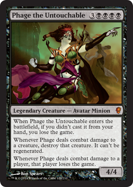
While Phage has seen significant printing in both borders, this is something I'm not crazy about, but in more of an understanding mood.
Phage seems fun in a cube format, and I enjoy the artwork and things that go along with her.
This artwork feels a little like a "digitally remastered" version, for some reason. Maybe it is. Everything looks smoother and sleeker. Phage in Blu-Ray. In Stores June 6th.
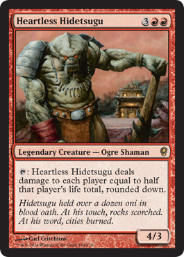
My love for HH is well-documented here, and it remains one of my favorite decks.
Still, I don't see the cube value of this card. After spending serious time drafting and picking out cards, HH is put into this Cube pool to make the game go faster?
In my experience with Cube and FNM Draft formats, I understand how it relates to the latter. In cube though, there are a lot of players with 20 life. In Commander, HH's first ability trigger is a big chunk, but it keeps people in the game. The second hit is brutal.
I'm not saying it's wrong to put this card in cube, or that it's unwelcome- I just don't get why you would versus other choices. Especially when the set's mechanics seem to be giving off a more political vibe. From my experience playing HH, he is the equivalent of the Honey Badger (The Meme, not Tyrann Mathieu). He just doesn't give a shit. Everyone takes pain equally, and through all the hurting, you've got to figure out how to stay alive.
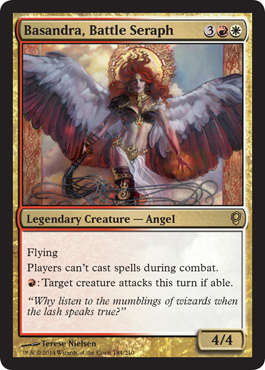
On a Stack episode some time ago, I tore this card apart. I like Terese Nielsen, but I don't like this art. It looks like the kind of artwork people have on rugs that they hang on their walls. Not that there is anything wrong with this, if it looks good. Beauty is never in the eyes of this beholder. I have a completely different perspective on this altogether.
However, my assessment of what Basandra does hasn't changed. She's a legend that came out before we started blogging here, so I'll give you a couple pennies worth of knowledge you probably already know.
This card is poorly designed. I continue to die a little inside every time I have to attempt to understand why Wizards prints a card in these colors that with the most counter-intuitive rules text of all time. Were this Time Spiral, I might get it. That was the point in time which Wizards could wear the proverbial "Do-Whatever-I-Want-And-Get-Away-With-It" Badge, and that time has long expired. Were they to have announced another Spiral-esque block in the Fall, I might've even given them a pass too.
But I really can't stand this card. It's just so bad, it's hard for me to look at. I encourage you all to do the same. Just look away, kids.
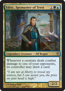
Last of the old business, we have Edric.
Case you don't know, this deck is good. This card is good. The deck is aggressive. It's enough to confuse most players, even good ones, into thinking that they shouldn't attack someone with an army of Elves or 1-drops on the board by Turn 5.
What you have to understand about Edric is that when you play against this deck, everything you know is wrong. Welcome to Crazy World, the place where you don't want to draw cards, and there's someone attacking you with a bunch of little guys for lethal before turn 10 with counterspell backup.
There's a reason it's banned in 1v1. Edric's pure value there, and that's apparently too unfair for most people.
THE NEW
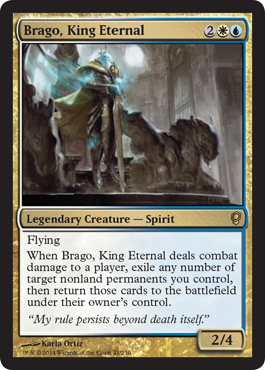
Let's start with Brago, the King of Blink.
While he may be one color short of Roon of the Hidden Realm, the dedication to blink colors and no-nonsense artwork courtesy of Karla Ortiz means those seeking ETB value not have to have a goofy kid's show character at the helm.
Not that there's anything wrong with this- I play silly decks all the time. Still, sometimes being a better player means respecting yourself, so that others respect you. If you're a believer in stuff like this, then the King Eternal is the Blink Deck Commander for you.
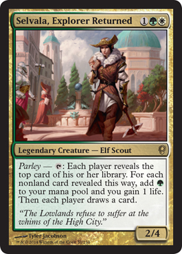
Next up is Selvala, sporting some goofy conquistador garb and and equally strange mechanic. A little too "Pirates of the Caribbean" and Group Hug for me.
What interests me about this card is the way the rules work here. What happens if Omen Machine is in play? What about activating this on an opponent's turn with Spirit of the Labyrinth in play? Where does the card go?
Though I'm not into this card, being a 2/4 for three is pretty appealing. We're seeing this a lot more, and it's clearly a home run in Standard right now. I guess if you love Courser of Kruphix, this is the Commander for you.
If this card was a little more selfish, and by selfish, I mean, wasn't part of the silly Parley mechanic where everyone draws a card, I could really get behind it. The life gain and mana in multiplayer matchups seems like a huge boost. I wouldn't recommend bringing this strangely gender-ambiguous character to the table in 1v1 though.
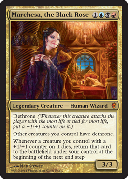
It's as clear to me as it is to everyone else that Marchesa is the gem of the Legends in this set.
Dethrone as a mechanic is slightly more political than I'd like it to be, but is totally manageable with access to Black. The key will be to get liberal with Ad Nauseam and Necropotence.
What's silly about this card being printed is that she already has a great dance partner in Black Mike (AKA Mikaeus, the Unhallowed), which gives this deck great value and design space.
My only real criticism of the card is that I think it does "too much." Other than that, I really love it. Matt Stewart's vision of Marchesa is stunning in every sense- colors, form, details. I'm not sure how any of her abilities make her a Wizard (The ability and artwork SCREAM Human Advisor), but this is going to be a hit, and going to be at tables.
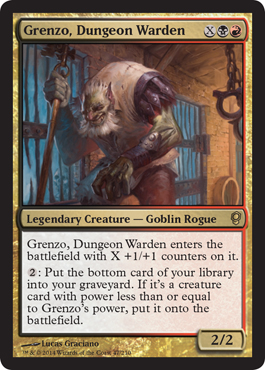
With Grenzo, we have another hit. If Wizards places their pegs right, they might actually be sinking my Battleship today.
I'm surprised the bottom-of-library-to-graveyard mechanic hasn't taken off. In Innistrad, we got the ever flavorful Cellar Door, which was sweet, but something the world seems to have forgotten.
What I'm hoping for with Grenzo is that there will be more of these kinds of cards, and they will be good. Grenzo has a very interesting set of abilities that have been put together, and I'm excited to see what comes of it.
With an X cost in his identity, and a non 0/0 P/T, Grenzo's flexibility makes him aggressive like a Goblin while also giving him the potential to be big, like his Rakdos counterparts.
Combined with other seldomly used tricks like Reito Lantern, Grenzo really feels like a fun deck for the table. Definitely the one I'm most likely to play out of the set.
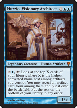
Last but not least, we have the world's most Italian Magic Card of all-time. Muzzio!
I hope more people will be saying his name than Arcum's soon. Although he's definitely underpowered in comparison, the lone mono-colored legend is basically giving us a look that says "Break Me."
Now, I don't think it's supposed to, but this artwork makes me laugh. It's so clear that Muzzio's da Vinci inspired by the eccentricities and inventions in the background it hurts. I'm not sure what he's wearing though. Looks like he bought clothes off the Aladdin mannequin at Disney. I guess he really wants to show us a whole new world.
What are your thoughts on Conspiracy? What cards are you interested in? Let us know in the comments down below.
Pass.
-UL
Showing posts with label Basandra. Show all posts
Tuesday, June 3, 2014
Saturday, September 28, 2013
The Stack #28- Art(ist) Appreciation Day
We're releasing our inner Art Snob today on The Stack as we talk this often-seen-but-seldomly-appreciated part of Magic.
I've found that as I continue to play this game, art has become one of the subtle differences that has influenced my deckbuilding as of late, whether it's just playing alternate artwork to help reinforce the theme, pure pimpage, or a little bit of both.
I have a lot of respect for the creative process. So much goes into making Magic cards, and I think getting the artwork done is the most difficult part. Art on a card is a lot different than on canvas. It takes real skill to develop a piece that really complements a card's frame and border. For those who haven't played Magic since the dawn of time, they've come a long way from say, the Chronicles/Arabian Nights printing of Fishliver Oil.
| This just looks like a day on the lake. In 1973. |
UNCLE LANDDROPS' PICK
Uncle Landdrops- THUMBS UP
With art and other things that are viewed as an expressive medium (music, films, literature), I tend to hold one simple-but-difficult first impression piece of criteria:
If what you're reading, watching, looking at, or listening to ever grabs your attention so completely that it floods your senses and reminds you of those things that connect you to the world, chances are it's pretty good art.
Steve Argyle's work on Admonition Angel is one of the first Magic cards that had this effect on me. Back then I didn't worry much about the top half of any card, which is something that newer players probably don't care about anyway. Admonition Angel didn't really change my sentiments either, but it did make me stop and admire, which I'd say is the beginning of my appreciation for art on the card.
I've stared at this art many times since, and there's just so much to love about it. The perspective is sweet, the light and contrast are immaculate. Even the stained glass has beauty to it. Argyle is particularly fond of this color palette (Pink-Purple-Orange-Black), and you probably see a lot of his work without even knowing it. Everflowing Chalice, Deathrite Shaman, Chandra Ablaze, New Nevinyrral's Disk, Somberwald Sage- it's all Argyle. So not only is his art pretty cool, it's also printed on playable cards.
Johnny Confidant- THUMBS UP
I'm Always appreciative of Argyle's work, not to mention I have some of his aformentioned cards as key players in my Primary edh decks. New Bloodbraid elf, Praetors Grasp, and not to mention Damia are all cards he's done that are personal favorites of mine.
Mythic card, Mythic Art, Nuff said
Grandpa Growth- THUMBS UP
Up above UL talked about appreciating Carl Critchlow's work more in the Modern card era. An important transition began to happen around this time that redefined Magic from an artist's perspective. The creative department started mandating that art come to them in a digital medium. This had a number of effects, chiefly that old school artists like rk post and Terese Nielson and other big names had to shift how they created their works. Paint on canvas was no longer an acceptable medium. This created a huge style shift within the game and one that I think ended up being a net positive. Steve Argyle is part of what I consider the 'new wave' of MtG art. This logistic policy change allowed him to enter the game and showcase his incredible color, balance, and attention to detail. Now he is well known and well established within the game and is frequently called upon to work on high profile cards. He is in high demand at large events and conventions because fans of his work constantly want sketches, signatures, and alters of his cards.
Venser's Journalist- THUMBS UP
UL's quip about newer players not really caring about artwork much is absolutely true! Unless we're talking about my brief obsession with MTG when I was 8, before I realized it was an actual game with rules and strategy.
This card does have some impressive illustration though, which certainly fits the card's title. In a dark background, an angel shines light from her halo, and bears a sword (possibly, a sword of admonition?) to vanquish the evil that lurks in the darkness.
Then again, it is a cathedral, so what evil could lurk there except the one lady who falls asleep during all the sermons? Also, isn't the ground in Zendikar a bit to unstable to build a solid foundation for a church? These are just some technicalities that are running through my mind looking at this card.
VENSER'S JOURNALIST'S PICK
Venser's Journalist- THUMBS UP
Nothing is more refreshing than seeing a cool stream of water run through some misty looking trees. If I were thirsty and in a desert, this card would bring tears to my eyes. If I were in a dentist's office, this artwork would ease my mind, if only a little bit. Oh, beautiful streams of Blue mana, bear unto mine eyes this beauty in every Blue deck that I've built!
Johnny Confidant- THUMBS UP
Probably one of my favorite Land arts of all time, Recently in the M14 set Jonas De Ro has some impressive artwork pairing with Andreas Rocha with the Sunrise/sunset look of the lands. Artwork on lands are gateways to the world that we are in, core set aside it is truely the only way to see the environment of the plane while you play in it.
Uncle Landdrops- THUMBS DOWN
This particular art isn't doing it for me, but I do like John Avon's work a lot. The river rocks in this one are the big turn-off. GG will talk about Avon a little later, particularly concerning land, but I like a lot of his nonland pieces as well. I play a lot of cards with Avon art, and I don't tend to believe that's just a coincidence.
Grandpa Growth- THUMBS UP
Lorwyn had plenty of inspiring pieces of art. From a creative perspective, choosing to have islands depicted in rivers rather than in oceans is a stylistic breathe of fresh air. John Avon is a true master and an artist that the game simply couldn't live without. He brings in players. When people who are unfamiliar with the game see his art they know that the cards are a beautiful and professional product. Often, people are familiar with some of his pieces without being familiar with the artist himself.
GRANDPA GROWTH'S PICK
Grandpa Growth- THUMBS UP
Obligatory explanation of thumb criterion: In the game of Magic there are two artists that I think really impacted the game so significantly that it couldn't exist without them (at least not in its current form). These men are John Avon and Rob Alexander. They are best known for their landscapes, which are immaculate. They are two of the most popular, most utilized, and without a doubt most skilled artists in the history of the game. You get a thumbs up if your art is in the same league as the these two.
There is a greater challenge to illustrating creatures though. They have to seem lifelike. Not just beautiful, but also animate. They need to display anger, fear, kindness. These things don't always translate well onto the inhuman forms that populate the game's art. Critchlow is one of the best artists specifically for his work on creatures. He has been around the game forever and has illustrated some of its most iconic cards, particularly with respect to relevance in Commander. To name a few: Wildfire, Overrun, Memnarch, Darksteel Colossus, and Exhume. He also crafted the art for my favorite card: Sakura Tribe Elder. He is an excellent choice for reprints, as well. He has made fabulous updates such as the core set Phyrexian Arena and the Onslaught Clone shown above. In case this wasn't clear to some of our readers: this art is significant because it calls back to the original Clone art from Alpha; in a humorous way to boot.
Johnny Confidant- THUMBS UP
Originally I was going to say i've hardly used cards by this artist, but upon a quick Gatherer search i was proven Wrong. Sakura-tribe elder his previously mentioned friends are among my decklists not to mention edh infinite mana combo friend Exsangunate is also illustrated by him.
Not to sure, but i think my first rare from a pack was this Clone, Thanks for the nastalgia GG
Venser's Journalist- THUMBS UP
I am not an art aficionado nor do I have a particularly favorite MTG artist. But, I like the concept this art is seeming to portray. If you ran into a clone of yourself, and be honest, would your first instinct be to kill it? The philosophy of MTG knows no bounds.
Uncle Landdrops- THUMBS UP
With few exceptions, I'm not really fond of his work pre-Kamigawa. I find that before this point there are quite a few cards of his that lack definition and the contrasts that I prefer. Fortunately for us, his iconic cards were obviously given a lot more attention, which is economical and appropriate, and that's something I value. I like Quillspike, Murkfiend Liege, and Darksteel Colossus a lot, and his work on Legendary Creatures is pretty great- Rith, Memnarch, Infernal Kirin, and Heartless Hidetsugu are also nice, gritty looking cards which I find really define Critchlow's style.
JOHNNY CONFIDANT'S PICK
Johnny Confidant- THUMBS UP
Terese Nielsen has long been a favorite of mine, perhaps my most favorite artist. If there is a card I have that she has drawn I'll go grab it and use it. Her artwork is a soft and detailed expression that sometimes even blends together many different symbols and pictures into one work. Enter the Infinite, Decendant's Path, and Hunter's Insight are such examples.
Uncle Landdrops- THUMBS DOWN
Terese Nielsen art is fine. I'm not as much a fan of it.
Many people have theories about what art does and doesn't do. To me, all artistic mediums should work towards carving identity, which is what I find to be lacking. Her technique, as mentioned, is good.
Looking at Basandra, we can see exactly what I'm talking about. The best qualities of this piece aren't exactly "her" in this picture, but the way the we're drawn to the objects "around" her, which in this instance, also includes the wings attached to her. Though life-like and lovely, they are still a distraction as we attempt to look at a Legendary Creature, which is supposed to, in my opinion, have a little more identity. This probably would've been better for a non-Legend creature, which we can't necessarily totally blame Terese for in this case, but Wizards still didn't say "No."
Again, I find her to be a much better artist than someone who really can understand its appeal on the card. When we look at cards JC mentioned, like Enter the Infinite, or Hunter's Insight, I'm not wowed. These intangible things aren't particularly demonstrated well to me through her work for me to say I'm impressed.
Dryad Militant, Secluded Glen and Angel of Jubilation are pieces of hers that really work for me. None of the others really stick out for me.
Grandpa Growth - THUMBS UP
She is a true master and has been around the game forever. She is very active at conventions and has an impressive portfolio of non-Magic art as well. Her pieces, even older ones, have a unique look to them. The balance in her color use gives her art a very realistic feel. The soft earth tones and natural greens...there really isn't another artist in Magic who's colors look like this. This is what feathers look like. This is how they react under light. A stark contrast to the high-gloss, over-saturated look that many modern cards have.
Venser's Journalist- THUMBS DOWN
A little too gothic-cathedral-stained-glass-window for me; but, it fits the description of a Battle Seraph. Eat your hearts out, zealots, and gaze at this airbrushed beauty (whips don't seem so angelic to me...but oh well).
Well that wraps it up for this week. Be sure to share your favorite artist or art in the comments below.
Until next time, this UL and the TGZ gang telling you to take a day off, go look at a painting, and pretend you know what you're talking about. Enjoy your Saturday.
-UL/VJ/JC/GG
Labels:
Admonition Angel,
Basandra,
Carl Critchlow,
Clone,
Commander,
EDH,
Island,
John Avon,
MTG Art,
MTG Artists,
Steve Argyle,
Terese Nielsen,
The Stack
Subscribe to:
Posts (Atom)